Redesigning the homepage and lessons/pricing page
“LSDS Driving School” is a driving school based in Randwick, Sydney established in 2015 by Will, an ex-LTrent instructor who is now 73 years old with over 19 years of driver training experience. His driving school currently employs 3 instructors who cover 80 active students (average daily onboarding of 2 new students). The student pool comprises of a diverse set of demographic characteristics in terms of age, occupation, ethnicity, and gender.
Proposed client:
LSDS Driving School, Randwick
Role:
Product Designer
Responsibilities:
User research & interviews, wireframing, prototyping, usability testing
Challenge
Having more than 12 driving schools in the region where LSDS Driving School is active, the school is facing several issues - particularly the conversion rate on the website and the low number of new students onboarded every month. With high drop-offs in booking experiences, it was identified as a major risk area from a revenue generation and predictability perspective.
Goals
1. Improve the conversion rate of visitors booking the trial lessons.
2. Improve the usability of the homepage.
3. Reduce booking drop-off rate.
Final Design
Below are the high-fidelity output screens showing the final product. These designs were developed following the design process described after the below mockup section.
Mockups
01. Homepage
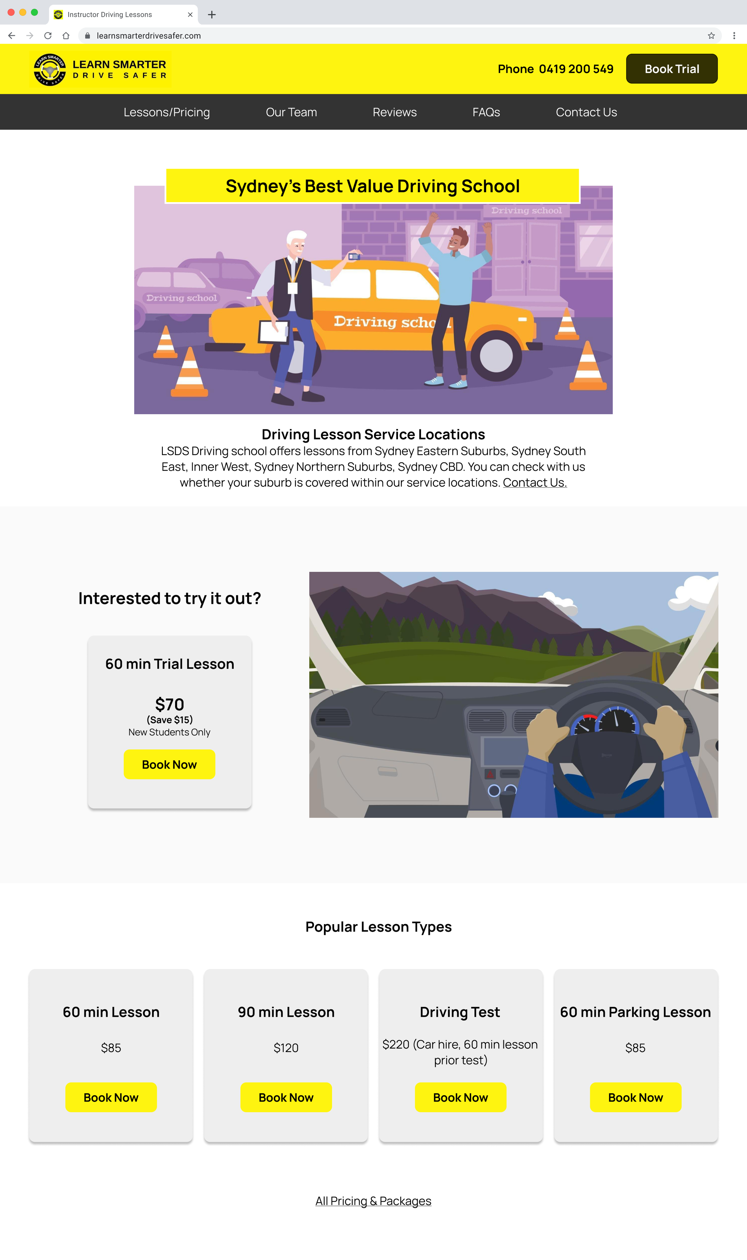
Information on the homepage are shown in order of importance. Users can book a trial lesson directly from the homepage.
02. Lessons/Pricing page
Users will be able to see all lesson types and pricing from this page. The contents of lesson type are clear and CTA button is easy to find.
Part 1: Discovery
Quantitative & Qualitative analysis
From the initial interview I had with Will, I understood that his concern relates to the conversion rate on his website and the number of new students he manages to onboard every month. I carried out usability testing to find out whether users could complete specific tasks such as finding the lesson and pricing information and booking a lesson.
Findings from Will:
Only 6% of total visitors out of the 1,000 visitors each month made a booking.
Constant need to attract new students to replace existing ones.
Trial lesson is the most popular lesson being booked.
Identifying the current problems
Below were the current issues users were facing that I found from the usability testing. Understanding these problems, allowed me to improve the design.
01. Difficulties finding information
Too much information and text.
Sitemap with irrelevant 17 pages.
Inconsistent and messy UI.
Long task completion time due to many clicks and scrolling to find the right information.
02. Information overload on lesson page
Difficulty finding the trial lesson.
Confusing UX writing.
Inconsistent and messy UI.
Too many different lesson packages.
Part 2: Creating the design
Redesign to improve the experience
I wanted to make sure the following goals were achieved in this redesign.
Reduce drop-off rate and increase conversion rate by:
Redesigning the entire homepage.
Redesigning the entire lessons/pricing page.
01. New sitemap to include only
relevant pages
Reduced sitemap from 17 different pages to 5 pages.
Information on the home screen shown in order of importance:
1. Driving school’s location service
2. Trial lesson booking
3. Popular lesson types + All pricing & packages
4. About the team
5. Student reviews
6. FAQs
02. New lesson/pricing page for
easier navigation
Narrowed down the lesson packages offering.
Clear and consistent UX writing and UI elements.
Minimal information to not overwhelm the users.
Part 3: Usability Testing & Iterations
Findings from usability testing
Usability testing was conducted on the redesigned prototype to see if specific tasks were able to be completed seamlessly. The participants were asked to complete the following tasks:
1. Finding about the lesson type and pricing
2. Booking a trial lesson
These were the results from the testing:
Task success rate achieved 100%.
Task completion time improved by 90%.
Participants understanding how to navigate the website achieved 100%.
Part 4: Metrics & Learnings
Measuring Success Metrics
A successful redesign should lead to:
Increase in conversion rate (visitors booking lessons).
Decrease in the drop-off rates at checkout.
My Takeaways and Learnings
The idea to redesign the website came from my own experience in using the website as a student of the LSDS Driving School. I knew there was so much work that could be done on the website and make Will’s business successful by creating a better website. I believe the biggest challenge the website was facing was the overload of information on every page which was unnecessary for the users who simply just wanted to find out information about the lessons and book a lesson. It was crucial to redesign and simplify the website in order to increase the conversion rate and increase the number of active students for the LSDS Driving School as per Will’s objectives.
Having a design system is crucial.
“Simplicity is key” rule worked for every aspect in the process.


