FastDoc Mobile App
Project Duration: 7 months, part-time
FastDoc is an all-in-one mobile application that facilitates the experience of obtaining medical treatment by any type of practitioner. The application provides an end-to-end solution allowing users to search for medical practitioners, book appointments, attend online consultations, and store medical information and records. It is especially useful for working professionals subject to irregular hours as it provides a centralized administration system.

Role: UX Research / UX Design / UI Design
Duration: March - September 2023, 7 months
Tools: Figma, Usability Hub, Optimal Workshop, Microsoft Excel, Google Forms, Miro
As part of my CareerFoundry UX Design Immersion course, my assigned project was to create a responsive mobile app that enables anyone, anywhere to connect with a medical expert. The project allowed me to gain experience through every step of an end-to-end UX design process.
OVERVIEW
PROBLEM
Users need an efficient way to find a doctor when they have any sort of health issues. They need an all-in-one platform where they can book an appointment any time of the day, and be able to access their medical information in just a few clicks.
SOLUTION
Deliver a mobile app that enables users to access their medical information, medical appointments history and medical records and which allows the users to easily book appointments with medical experts and even provide the option to attend online consultations.

PART ONE
Understanding the User
Competitor Analysis
To position FastDoc effectively in the market, I conducted a competitive analysis of notable competing apps. This competitive analysis helped me to understand the competitors’ core problem-solving approaches and identify opportunities for FastDoc’s value proposition.


Competitor Analysis takeaways
There are competitors such as HotDoc, Instant Consult, and Healthengine that provide general information on clinics and doctors. However, it is uncommon to find an all-in-one medical booking app where that provides a variety of features.
Our app needs to improve features of what the current existing competitors have on top of other features users wish to have on such medical booking apps.
As traditional processes are shifted to be digitalized, and many industries shifting to digital, the current market of medical booking apps is still weak.
User Interviews
After conducting the competitive analysis, I moved into validating findings through user interviews, affinity mapping, and card sorting.
I utilized Optimal Workshop, Career Foundry’s Slack community, and my network to perform these.
Furthermore, I asked four people in my network if they’d be willing to do online interviews. I was able to dig deeper into my app design by bouncing ideas off of them and receiving direct feedback.
Research Goals
Understand the specific challenges and hurdles users face when needing to attend a medical appointment.
Understand how users are currently searching for and booking medical appointments. What medium do they use to book their medical appointments?
What kind of features would users want to access in the FastDoc app.
User interview takeaways
Google search is the common way people search for medical experts.
The difficulties with existing booking systems is when users have to make adjustments to, and cancelations of bookings.
Typically, medical appointments are characterized by urgency.
Preference of video consultation or in-person appointment depends on the reason why they want to see the doctor
People prefer getting their booking confirmation, invoices, and payment links online by email
PART TWO
Defining the problem
Affinity Mapping
With the qualitative information I gathered from the user interviews,
I proceeded to do affinity mapping.
The affinity diagram shown below helped to organize user’s insights and feedback into groups of similar items.
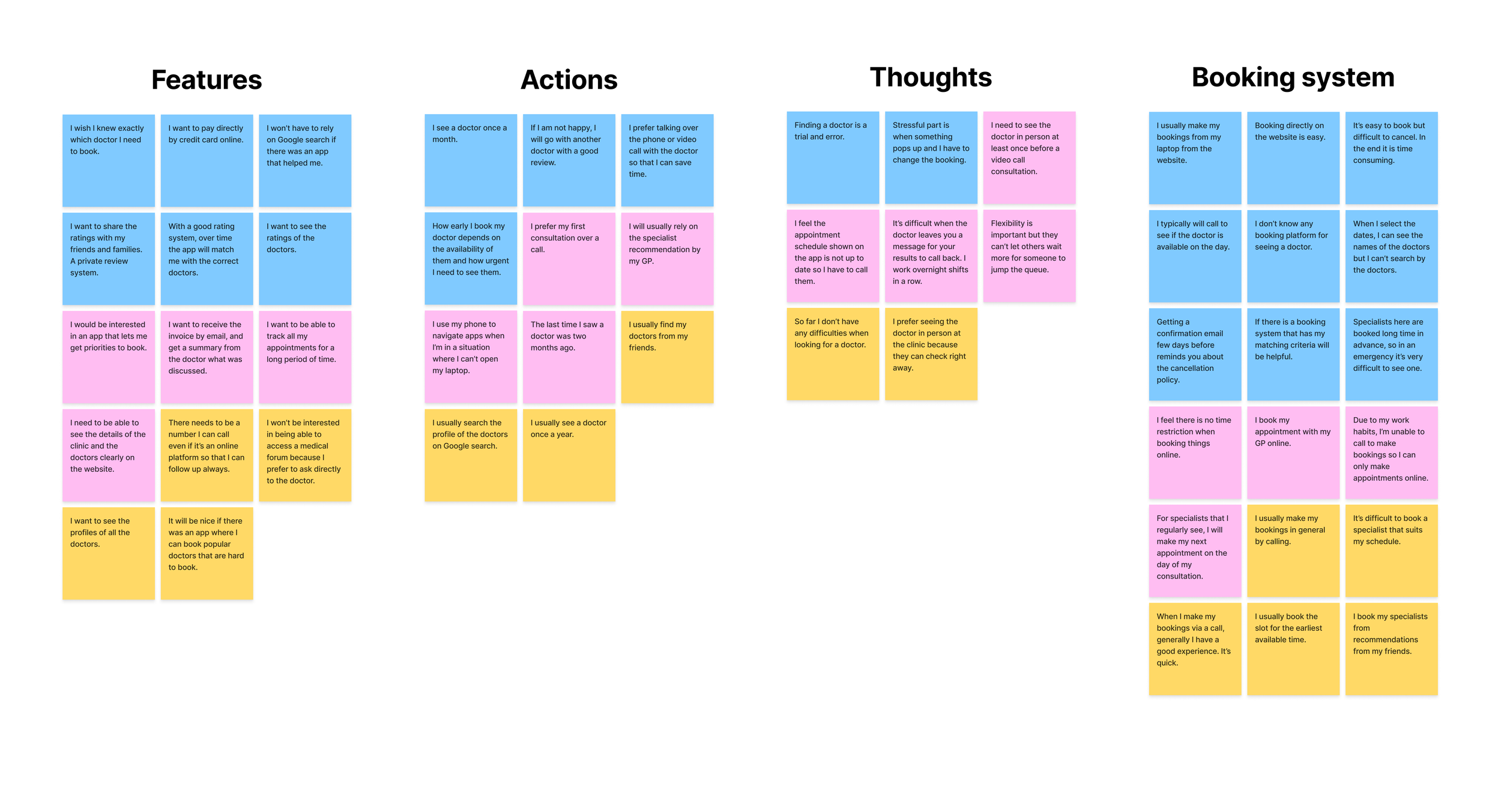
After analyzing the data, I discovered the following insights:
Existing healthcare platforms are complex, emphasizing the need for a simple interface to enhance the overall user experience.
Users face challenges in booking doctor appointments that fit their schedule.
Users face the frustration of long waiting periods until their appointment, emphasizing the need for an option for online consultation.
Recommendations from friends and reviews hold significant weight for users when choosing a doctor.
User Personas &
Task Flows
In addition to my above research, user stories, scenarios, and task flows helped me prepare for the wireframing process.
In this way, I gained deep insights that helped me to create and uncover, my personas for FastDoc.
The insights I gathered during my research helped me develop two personas:
Brian - the adventurous expat banker
Kaylee - the busy single veterinarian

Persona 1:
“As a busy working professional who is tied up with meetings all day, I want to be able to search for a doctor that meets my criteria immediately, so that I won’t have to waste my time going to several consultations with different doctors.”
- Brian
Sign up and Create an account
Search specialist
Add filters to meet the criteria
Browse and select specialist
Make payment
Confirm booking
Task Analysis:

Persona 2:
“As a veterinarian who works on a 13-14-hour shift, it is very difficult for me to pick up my medical exam results as the clinic is closed when I get off from work. That’s why I want to be able to collect all my medical results on an app along with any additional comments from the doctor so that I won’t have to wait so long to get my results.”
- Kaylee
Log in
Home Screen
Go to ‘Medical results’
Select results
Check results
Book an appointment if necessary
Task Analysis:
User Flows
The next step involved translating user tasks into user flows, providing insights into what app screens and features would need to be included.
01. Search for a specialist and book an appointment
Brian, due to his busy work schedule, has difficulties booking an appointment with the doctor. Given his demanding job, he wants to be able to search for a specialist accurately and make an appointment easily.

02. Check medical results
Kaylee, a veterinarian, often receives missed calls from clinics during her shift to call back for her medical exam results. She struggles to call back during office hours and sometimes it ends up taking a week or two. Kaylee would want an easier way to receive the medical results via an app.

PART THREE
Creating the design
Low-Fidelity &
Mid-Fidelity Wireframes
Being able to narrow the filter search, explore, and connect with a medical expert as well as being able to check your medical lab results information on the app was a highlight feature of FastDoc. I also made sure that I included in the filter section if the user has 'Medicare’ or a ‘referral’ from their GP as in Australia these two are required to be able to book a medical specialist and often, expats don’t have Medicare and later get rejected at the time of booking.
With these main features at the forefront of my mind, I began sketching low-fidelity wireframes to shape the app’s design.


I then used Figma to develop my low-mid fidelity wireframes to Mid-fidelity wireframes to clarify and define FastDoc’s features and ensure my design stayed user-centric as it evolved. This iterative process allowed me to visualize areas for improvement, simplifying designs to better serve users.
From here, I was able to take my mid-high fidelity versions that would be easier for people to grasp in usability tests. Below, you can see an example from some of my mid-high fidelity mockups.


PART FOUR
Testing the prototype
Usability Testing
The goal of this usability test is to evaluate how users of FastDoc utilize the mobile app for the first time. We would like to see if our FastDoc app is intuitive to use and if the included features provide users with what they need.
(View Usability Test Plan here.)
Test Objectives
Assess the usability of all the features in the FastDoc app
Measure the learnability of the app as a whole
Identify where users make errors
Get feedback on what can be improved about the app
I mocked up a clickable prototype using Figma. I conducted the first usability test by moderated remote testing, using six helpful participants. I presented them each with background questions, scenarios, and tasks to complete and took notes as they carried out the test.
Scenario: You have just downloaded the app and are interested in finding out more about the app and seeing what features it offers.
Task 1: Sign up as a new user
Task 2: Book a video consultation on 20th June at 9:15 am.
Task 3: Find out your blood test results.
Positive Quotes
“It was easy to make an appointment”
“It’s great to be able to see the medical exam results”
“Onboarding is straight forward”
“It’s good to have past results in the app”
“Good that you don’t have too many buttons on the home screen”
Negative Quotes
“You should group the appointments”
“Add more information on the payment page”
“Account button is unclear”
“Not sure what the difference is between ‘My Info’ and ‘Account’
Observations
Didn’t know the difference between “account” and “my information” button.
Took time to understand the flow and how to navigate the prototype.
Expectations of the prototype were very high.
Stuck at the login/sign-up page.
Couldn’t find where medical results were from the home screen.
Errors
Can’t find the Sign-up button.
Clicked login instead of sign up.
Doesn’t find the medical results button on the home screen.
Wasn’t sure where to click to see the specialist’s profile.
Wasn’t sure where to click after the payment successful page.

I used an affinity map to organize information into observations, positive and negative comments, and errors. I then analyzed these insights using a rainbow spreadsheet and prioritized each error by using Jakob Nielsen’s error severity rating scale.
View rainbow spreadsheet here.
Design Iterations
After analyzing the rainbow spreadsheet, I made design iterations for the ones with the highest error ratings as these were features I had to make changes before moving to the finalization of the product.
Issue 1: Users find sign up button difficult to find
(Error Rating - High)
Suggested Change
As for new users, it would make more sense if the Sign-up page was the first page that they see instead of the Login page. Therefore, we will bring the Sign up page up first where they can fill in their information. Users who already have an account won’t see this Sign-up page which will direct them to the Login page.
Evidence
5 out of the 6 participants found it difficult to find the Sign-up page
Participants clicked the Login button instead

Issue 2: Users find ‘Patient’/’Practices’ page confusing
(Error Rating - High)
Suggested Change
This page which was shown right after the onboarding page confused most users because they still hadn’t signed up so it was an unexpected flow. It would be better if this page came in the beginning right after the splash screen. Also, it will be important to change the wording so that it won’t confuse the users.
Evidence
5 out 6 participants found it confusing with this page and did not expect it to come up right after onboarding
Participants asked for clarification for this page

Issue 3: Users were confused with the onboarding pages
(Error Rating - High)
Suggested Change
As there was a lack of information provided in our onboarding pages, users were unsure what the purpose was and didn’t see much value from the four pages. They were also frustrated that the onboarding came before the sign-up page as it had confused most participants why it was in this order. Due to these results, we will move the onboarding section to come after the Sign-up page and also change the text and layout of the four pages.
Evidence
5 out of 6 participants found the onboarding very confusing
Participants asked what they had to do on each screen

Issue 4: Users find the home screen confusing with too many ‘appointment’ buttons
(Error Rating - High)
Suggested Change
Instead of the buttons being listed in order from top to bottom, we will change so that the key buttons are shown easily at one glance. This will prevent users from guessing and clicking several buttons to complete their tasks.
Evidence
5 out of 6 participants found the home screen very confusing
Most confusing buttons were ‘My Information’, ‘Past appointments’, and ‘Confirmed appointments’
Participants were frustrated that the appointments were not grouped together

Issue 5: Users were unable to find the ‘Medical results’ page
(Error Rating - High)
Suggested Change
The ‘Medical Results’ page was not found at a glance from the home screen in the clickable prototype that we had tested with the users. To get to this page, the user had to click ‘past appointments’ to get to the medical results, however, users clicked several other buttons to complete the task. We changed this flow so that the users will be able to see the ‘Medical Results’ button at a glance from the home screen.
Evidence
6 out of 6 participants were not able to find the ‘Medical Results’ page on the home screen
This issue had the highest error rating and it was crucial to make a change to this


Conclusion:
Overall, the session has helped me to notice new findings and has added great value to my app. Participants
had different opinions on certain tasks but some had similar feedback which was very useful to enable me to understand what the pain points were in my prototype.
Preference Testing
We conducted preference testing using the tool Lyssna (Usability Hub) to gain insight into understanding our target audience which helped us to make better design decisions.
For this preference testing, we have decided to test out the onboarding screens by seeing which text used on the four screens people preferred over another. Version A is the original set which outlined some of the features of the app, and Version B is the second set focused on using tagline phrases.


Results:
There were a total of 15 participants for this preference testing. The preference test results showed that Version B performed better. Also, the feedback that was provided gave some insights into what people thought about the two versions.

Design System

Polishing The Design
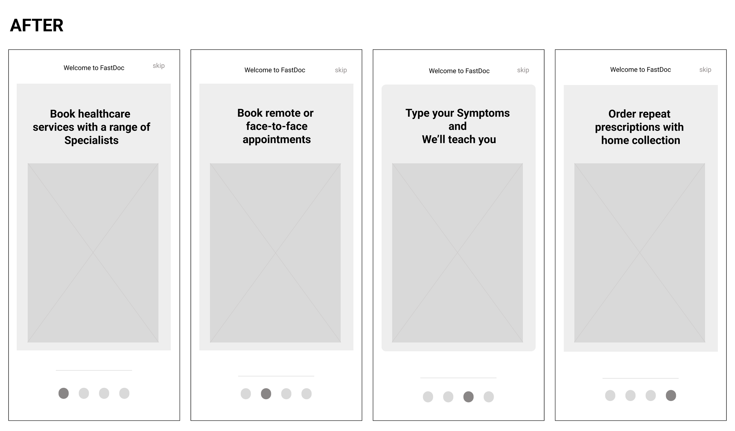
Throughout the findings, I worked on polishing the wireframes and prototype. Below are two examples of how I’ve polished the design for ‘Onboarding’ and ‘Home Screen’.

The first idea was to list out some of the key features of the app in the onboarding screens, but after my preference testing, users preferred the catchy slogans more than the version that explained the features.
The wireframes in the early stages had the image at the top with the text supporting below it, however, we realized that it was more important to have the users to see the text more than the images so we have switched the positions so that the text came at the top of the image.

The original low-fidelity wireframe was not used due to the negative feedback during
user testing. Instead, the design was changed so that the users could see what the purpose of the buttons was at a glance.Nine buttons overwhelmed the users so this was minimized down to six main buttons.
User Interface Design
FastDoc didn’t have a name until the very end of this project. It was important to make sure that the name represented the modalities found in the app which helps people to connect with any doctors despite users’ busy lifestyles.
Originally, I desired either a blue or green color palette design for FastDoc. However, as I moved through the rapid prototyping process, I pivoted towards a turquoise, blue-to-green color scheme as most people who tested my app mentioned this color resembled more of a medical and healthcare app.
As the design process progressed, I reflected on all of the feedback I had received and then had to make decisions reminding myself of the reason for creating this app for the users. I decided to create FastDoc by using a minimalistic color scheme so that it will make the app more appealing to all genders as well as give it a timeless feel.
From a usage standpoint, FastDoc is an all-in-one solution medical booking app for busy working professionals who want to have access to booking a medical specialist at their convenience, along with having access to useful features such as receiving medical exam results directly to the app and booking video call consultations.
Final Delivery
Onboarding that presents
high-value features
The app welcomes the user with an onboarding that shows the high-value features of what they can expect.
It shows users from the beginning that the app has a user-friendly interface that is designed so that users can access their medical information anywhere and anytime.

Filtered search and
save time

Users can filter their search so that they can get the most accurate results to save time. The app allows users to refine their search by criteria such as gender, availability, opening hours, type of consultations, and other information as seen below.
Hassle-free
appointment scheduling
FastDoc makes it easy for busy working professionals to book appointments that align with their schedules. No more phone calls to the clinic to make appointments during office hours. Users can put in their payment information and make a booking in just a few clicks.

Fast Medical results
Having users receive their medical exam results through the app, allows users to skip all the back-and-forth process of calling the clinic to get their results. No more worry about missed calls or going to the clinic to get your results from the doctor.

What FastDoc taught me
User-centric design is everything. I put a lot of focus into understanding the user before developing the wireframes. People have very different views and experience an app journey differently. A perfect solution to one may not be helpful for someone else. This makes it challenging to design a product that is user friendly, helpful and satisfies needs for a wide group of potential users. To do this, many compromises need to be made at the designer level, who need to put his/her own subjective views aside and follow a clear design process to ensure that the end product is satisfactory for all users. As such, I learned that designing is all about following a clear process in which the designer’s own opinions and views are secondary to the eventual users’ needs and requirements.
See the final High-fidelity prototype here