Perfect Properties
A responsive web app for property buyers looking to purchase real estate properties.

Project Duration: 2 months
Role: UI designer
Platform: Responsive Web App
Tools: Figma
As part of my UI specialization course with Career Foundry, I chose to work on developing the UI of a real estate product. To begin the project, I was provided with the UX research context such as the user persona, user stories, and feature requirements so that the primarily focus was on the UI design.
Overview
Real estate investment is a popular way for individuals to achieve financial security.
It is an exciting and emotional experience, but often complicated. Buyers new to the market may struggle to get started without professional guidance and waste time viewing properties out of their range.
Problem
To create a responsive web app that provides property buyers with customized information on properties of interest and to help users by providing them with the expertise needed to get started.
Solution
Perfect Properties was designed with a user-centric mindset to focus on the needs of users like Rashida. It was important to make sure that the web app provided easy access to what the users were searching for.
User Persona

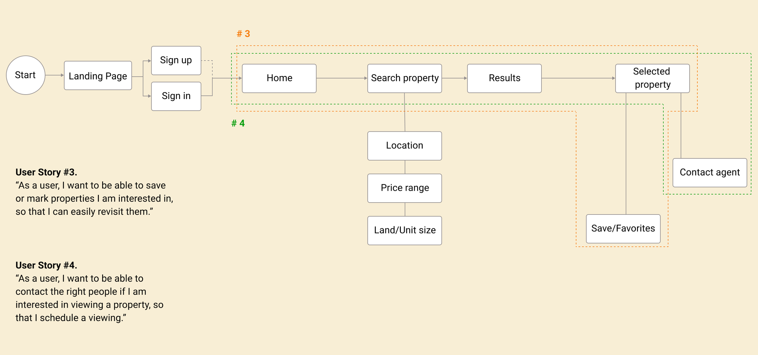
As the next step, Rashida’s user stories were evaluated so that I could proceed with the Task analysis, and also to understand the key features that were needed by the user.
User flows were then created showing the user’s movement through the product, mapping out every step the user takes - from the entry point right through to the final interaction.
User Stories & User Flow

Color creates an impactful dialogue between the design and the audience. I chose a mood board that represents a calm, and clean style. It was important to ensure that the colors and images used throughout the app were fresh and simple, and did not have an overload of information that would overwhelm the users.
The color green represents harmony and freshness, and evokes feelings of peace due to its connection to nature. The color beige symbolizes simplicity, comfort, and trust, which complements well with green to create a sense of security and reliability.
Moodboard

Low Fidelity &
Mid Fidelity Wireframes
With the visual direction guided by the mood board, I started sketching out my
low-fidelity wireframes.
[LOW FIDELITY WIREFRAMES]

Landing Page

Sign in Screen

Create user profile

Filter Search

Property Profile

Contact agent
Using the low-fidelity wireframes above, I converted these wireframes into digital by using Figma and drew out the mid-fidelity wireframes by working on the visual hierarchy, design patterns, and the content structures.
[MID FIDELITY WIREFRAMES]

Landing Page

Sign in Screen

Create user profile

Filter Search

Property Profile

Contact agent
High Fidelity Wireframes
Once each high-fidelity wireframes for all screens for mobile were developed,
I created my grid system for the other two devices (desktop and tablet) with different breakpoints.
Below are the high-fidelity screens.


Style Guide

Takeaways
In this UI specialization project, I have learned when creating a responsive app, I must consider the different breakpoints and make sure the design accommodates different display sizes and resolutions. The mood board is also important to set out the color palette of what I’d like to achieve for the final product. The color palette changes the entire mood of the product and it is essential to make sure what decision you choose as a designer follows the goal. An effective UI is to make the user’s experience easy and intuitive, requiring minimum effort on the user’s part to receive the maximum desired outcome.
UI designers need to be very clear and communicate often and well with the rest of the team to produce a great product. Consistent communication is key, and understanding what and how to hand off deliverables to the developers, as well as asking questions to the team is important.